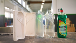
A dozen packaging designs that missed the mark

Brand owners and their packaging designers strive for a bull’s-eye with each new creative brief, but the package designs that make it into the marketplace aren’t always on target.
The reasons for failure are myriad. The package may be great looking and protective of the product, but it’s tough to open; a package may be convenient and easy to use, but it can’t be recycled; or a redesigned package may not do as good a job of ensuring product freshness as the original pack.
Combing through the designs Packaging Digest has covered in years gone by, we found 12 examples of packages that seemed successful at first glance—but generated reader comments ranging from constructively critical to downright hostile.
Read on to learn where each package went wrong, including the specific design failures that our readers discussed in the comments section.
1. Lipton tea bag box is not so golden
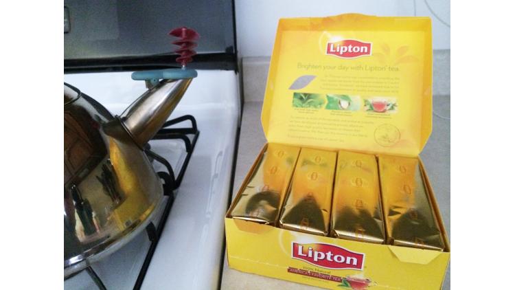
Though visually striking, a redesign for 100-count boxes of Lipton tea bags went sadly awry. The redesign eliminated individual paper wrappers for the tea bags and instead used gold foil sleeves on paperboard trays holding 25 tea bags each.
Several readers were concerned about freshness. One wrote, “If the purpose is to keep the tea fresh what happens when you open the gold foil up? 100 tea bags are no longer fresh! Don’t change something that works!!!”
Another piled on, writing, “Terrible idea to not wrap tea bags individually. Once foil sleeve is opened, tea bags [lose] their potency and begin to go stale. Been a Lipton tea drinker over 40 years.”
Other commenters said they missed the portability and cleanliness of individually wrapped tea bags, and some noted that unwrapped tea bags aren’t appropriate for foodservice.
Could there be an easy solution? Some readers suggested wrapping each tea bag in the foil.
2. Hellmann’s Real Mayonnaise squeeze bottle messes up
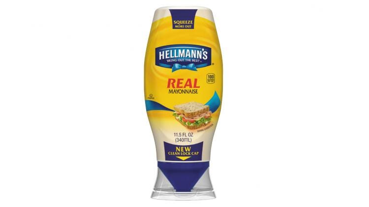
The Best Foods/Unilever squeeze bottle for Hellmann’s mayo and other products—designed to make it easy to “Squeeze More Out!”—went sideways with consumers for several reasons.
The inverted bottle uses a clean-lock cap for less mess and a precision tip for better control of dispensing, but apparently the design did not reliably provide these benefits. Numerous commenters complained stridently about how difficult it was to open the bottle. Some resorted to Google for instructions and at least one called the brand owner for help getting into the package.
Several other commenters reported that the bottle was messy, and that it was difficult to get residual product out of the bottle. “Messiest thing ever. Poor poor design,” was how one described the package.
Another wrote, “I have half a bottle left of this and can barely squeeze it to get any out. I am not a fan of this bottle. Waste of my money.”
3. Tropicana multi-serve PET bottle is difficult to open
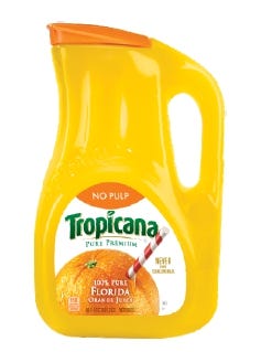
When PepsiCo switched to a polyethylene terephthalate (PET) handleware container for multi-serve Tropicana Pure Premium orange juice, it was shooting for an easy-to-open and -pour package that would be compatible with the existing PET recycling infrastructure. The transparent container, which holds 89 ounces of juice, has a flip-top cap.
The key metric on which the design falls short is ease of opening. Many commenters made the point that the package is anything but simple to open. “A consumer should not have so much trouble opening a product,” wrote one.
Another noted that the package must be “pried open with a knife.”
Yet another added, “I’m another user who needs a butter knife to open the container. Can’t do it with my thumbs. After I do the initial opening, I repackage it to another container. Stupid design.”
On behalf of the package design team, ouch.
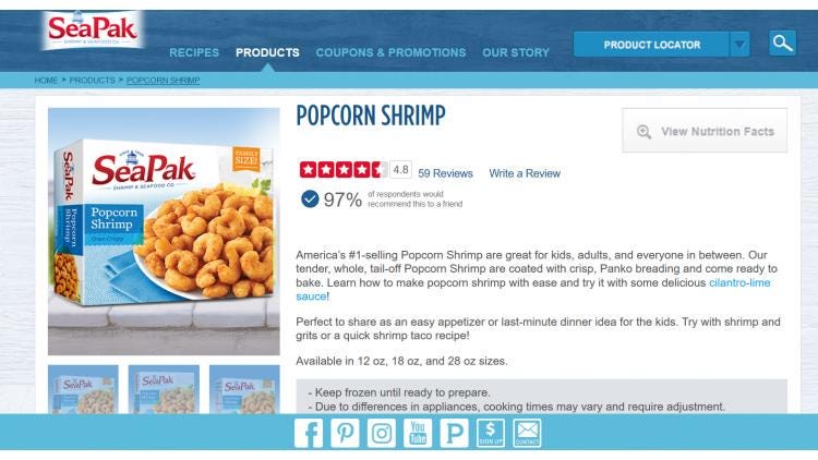
4. SeaPak shrimp bag graphics don’t sit well with some
Even packages that are quite well executed vis-à-vis structural design and innovation can drop the ball on graphic design. When the SeaPak brand changed its frozen, breaded shrimp package by adding a zipper to the inner bag and a one-color print with heating/cooking instructions, Packaging Digest executive editor Lisa McTigue Pierce was delighted.
Pierce wrote, “After I open the package, I can more easily store the leftovers in my freezer without taking up too much space, as well as see how much product is left so I know when to replenish my stock.”
But the package graphics irked one commenter, who argued the “packaging looks nothing like the product. A butterfly shrimp looks nothing like inside the package. Poor advertising. Want me to buy this again? No!”
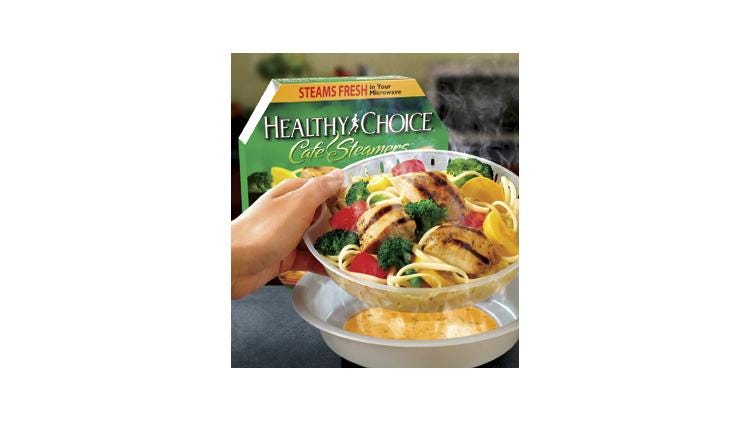
5. Conagra’s Healthy Choice Café Steamers spur microwave concern
The design for Conagra’s Healthy Choice Café Steamers frozen entree packaging features a microwavable two-piece plastic steamer. Film lidding seals the steamer, which is overpacked in a paperboard sleeve.
The packaging is convenient, certainly, but commenters took exception to the “healthy” moniker, raising questions about how healthy it is—or isn’t—to microwave food in plastic. Commenter Wayne Frazzini had heard that “microwaving plastic is a bad idea” but seemed confused as to whether the Healthy Choice package was somehow different from other plastic packaging and therefore safe to microwave.
Frazzini commented, “What is the consumer supposed to believe? Why isn’t this clearly stated on all packaging? If it is safe … [w]hy is it safe? It just doesn’t shout out the differences!”
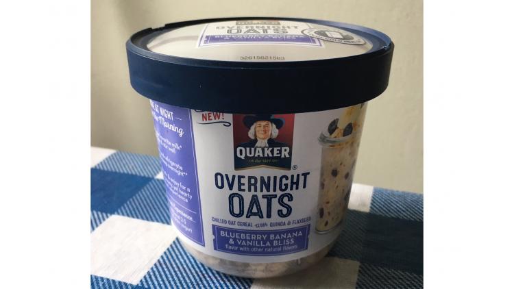
6. Quaker Overnight Oats trips on sustainability
The Quaker Oats Co.’s convenience packaging for a cold, oat-based breakfast cereal bothered several commenters on environmental grounds. The package is a #7 (Other plastics) single-serve cup with clear film lidding and an overcap. It contains 65g of product.
To prepare the cereal, consumers open the package, pour milk into the cup and let the mixture set up in the refrigerator overnight. Those who prefer hot cereal can pop the prepared product in a microwave oven for 30 seconds.
The size of the package and use of #7 plastic, which many curbside recycling programs do not accept, were sore points with commenters.
Amnon Zamir wrote, “The sustainability side of this packaging is totally overlooked. The volume of this package is at least 3 times more than required for 65gr of oats. That’s a lot of waste, a lot of truck space, increased carbon [footprint] ... it would make more sense to team with a milk producer and sell the product as a 150cc milk container with a flip top for the oats, and would be much better for environment.”
Another commenter added that “#7 plastic is not recyclable and so this product just adds to the destruction of the environment. I am appalled by this packaging.”

7. Orbit gum package structure elicits criticism
Responding to an Orbit Remix/Facebook package design app that enabled consumers to generate personalized package graphics based on their Facebook metrics, commenters focused not on algorithms, digital art or online privacy (the pack debuted well before Facebook’s Cambridge Analytica data scandal) but rather on the functionality of Orbit’s packaging.
David Baird commented: “The gum sticks to the paper lining inside of the flimsy cardboard package. Because of this, the lining usually comes loose from the package after removing the first couple of pieces of gum and it takes the rest of the pieces with it.
“You then either have to try to stuff all of that back into the package or remove the gum from the lining and discard the big wad of extra paper that came out with it. It’s just a mess.”
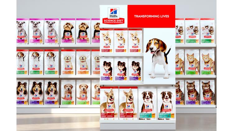
8. Hill’s Science Diet redesign brings out the worst in a critic
A redesign of packaging graphics for Hill’s Science Diet cat food and dog food got the goat of one commenter, who felt strongly that the new graphics were too similar to those the brand uses on packaging for dog treats. The redesign affected more than 2,000 stock-keeping units.
This commenter harangued both the brand owner and the design firm that executed the redesign, calling into question their creativity and integrity. Although he acknowledged that the new bags are white and the treat bags are black, the commenter blasted what he perceived as too much overlap between the two designs.
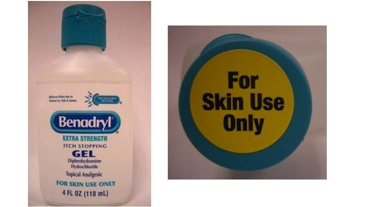
9. Consumers mistook Benadryl topical gel for an oral product
Johnson & Johnson knew its topical Benadryl packaging was flawed when consumers started ingesting the product instead of applying it to their skin—they were mistaking the topical product for the liquid, oral form of the brand. The consequences in some cases were serious and included emergency room visits and hospitalizations.
The two products have a similar consistency, but the gel’s package design also contributed to the medication errors. The “appearance of the Benadryl Extra Strength Itch Stopping Gel is similar to oral liquid Benadryl products,” the U.S. Food and Drug Administration (FDA) stated in a 2010 safety announcement, “including the shape of the container bottle with a tapered top and a flip top cap.”
The FDA also noted a “lack of clear and prominent direction on the front panel of the topical gel bottle indicating ‘for skin use only.’”
The brand owner addressed the problem by adding a prominent “For Skin Use Only” statement to the front of the bottle and also to the closure, and by doing consumer studies to figure out why people were ingesting the topical gel.
Benadryl Extra Strength Itch Stopping Gel is now packaged in a tube, which also states prominently on the front of the pack that the product is for skin use only.”
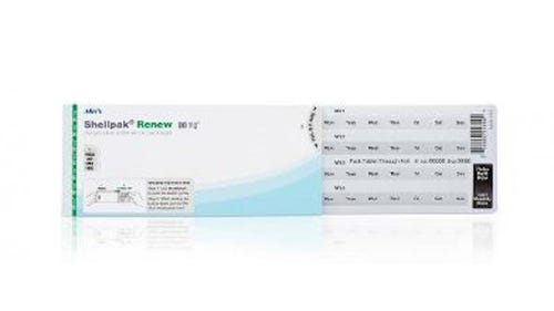
10. Opening the Walmart compliance pack stymies consumers
A Walmart compliance pack for pharmaceuticals may help consumers comply with dosing instructions, but commenters have complained bitterly about difficulty opening the package. The blister pack features a tear-resistant outer carton, easy-slide blister and integrated calendar for patients to track their medications.
One commenter wrote, “I’m an RN and a Certified Guardian. I think those who are prone to confusion or forgetfulness would benefit greatly with pill packs. However, when it comes to taking medication, there’s nothing more frustrating than not being able to open the package.
“Not only is pain an issue, but just giving up on taking it is [a] choice many have chosen simply because they can’t open the package! How about making it easier to open? Child proof yes, adult proof no. Figure this out you who invented it.”
Another commenter stated that even the dispensing pharmacist had trouble with the package: “He could only get one of them open. I ended up ripping the cardboard open and asking for a plastic pill bottle to put the pills in. I don’t know who they test the new packaging on but I’m sure it was not the elderly.”
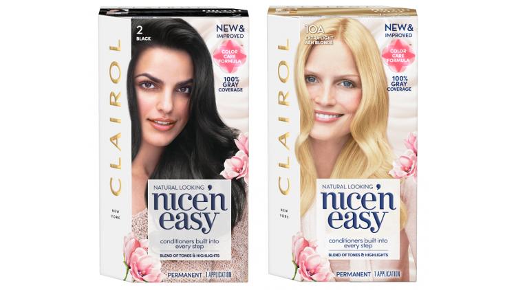
11. Coty/Clairol Nice’n Easy redesign: If it’s not broken …
Coty’s package redesign for Clairol Nice’n Easy hair color incorporates a hexagonally shaped carton and graphics with floral accents to evoke the product’s improved fragrance. The new cartons also provide hair-color information on the carton’s top and side so consumers can easily locate their hue.
But not everyone was on-board with the redesign. One commenter wrote that the original package design had “a far neater format. I am a long-term user of this product and professional designer. When I first saw the new packaging, I wondered why on earth they had changed it.”
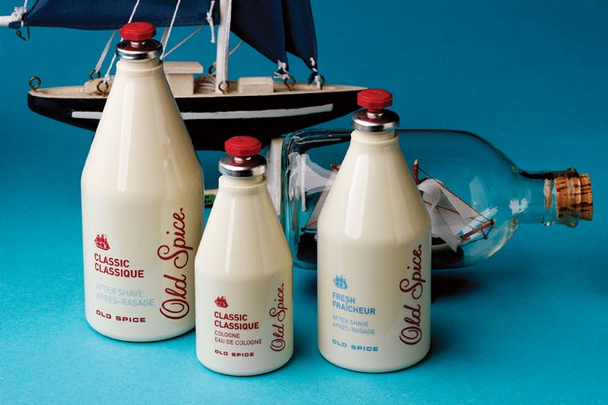
12. Consumers slam the switch to PET for Old Spice
The switch from imported glass to PET bottles for Old Spice products stirred up strong feelings among Packaging Digest readers who are (or were) brand loyalists. The PET bottles are shatter-resistant and more than 50% lighter than the glass bottles. They also require less energy to manufacture and transport.
But many commenters viewed the change-up as a marketing failure. Noting Old Spice’s “iconic place in history,” J. Derek commented that it is “key in packaging design to consider the effect that the packaging has on the consumer’s perception of contained quality. At least in its glass form, there was an antique essence that went along with its actual long and respected history. Changing it to plastic could have a similar perceptual effect to that of packaging wine in a box.”
Riffing on the same theme, Henry Corbett commented, “I love Old Spice classic cologne. I do not like the new plastic bottle; it looks very cartoon-like with that red stopper and the bottle is so light-weight in comparison to the glass version. I will still buy the cologne but plan to funnel the good smelling water into my empty glass bottle to set on my bathroom sink. Sorry, but plastic after-shave/cologne bottles [are] just not ‘grown-up’ enough for my taste.”
About the Author(s)
You May Also Like


